Going Up!
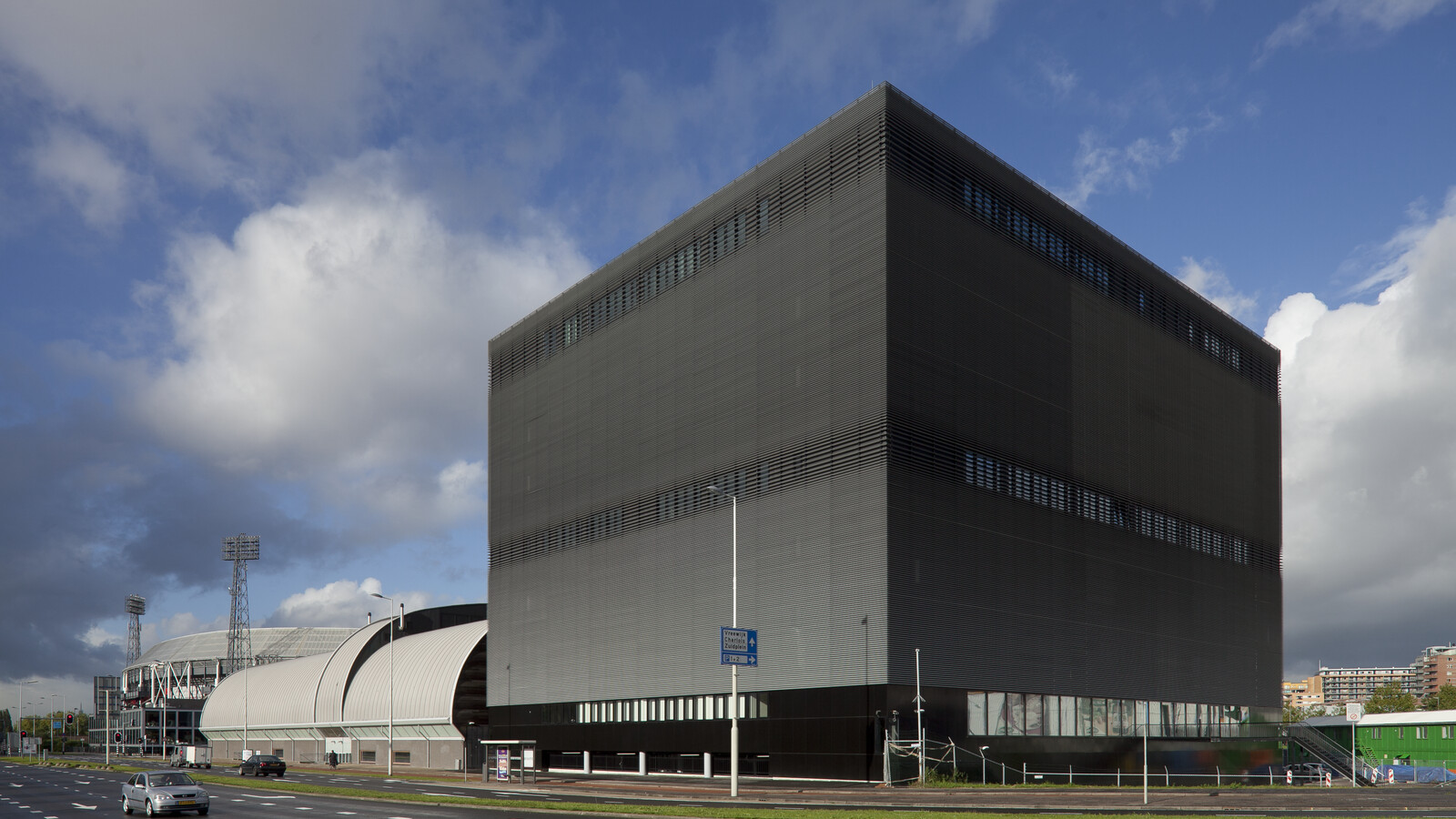
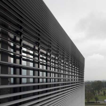
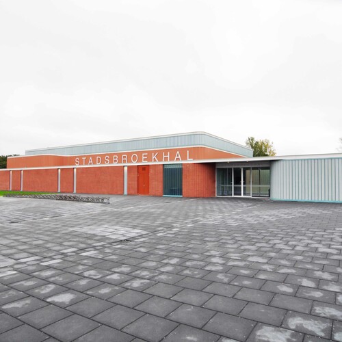
After only a few years it became obvious that the city needed more sports facilities. With a land scarcity in this sought-after part of town, the logical decision for the design to extend the centre was to extend upwards. Now, an underground parking garage and a building of seven floors exists. The existing, slightly bulging hall with its open style and wooden accents is connected by a transparent section where the elevators are located to what one could call its big sturdy brother: a towering high black volume with a facade of angled aluminium slats.
Ingenuity and reliability
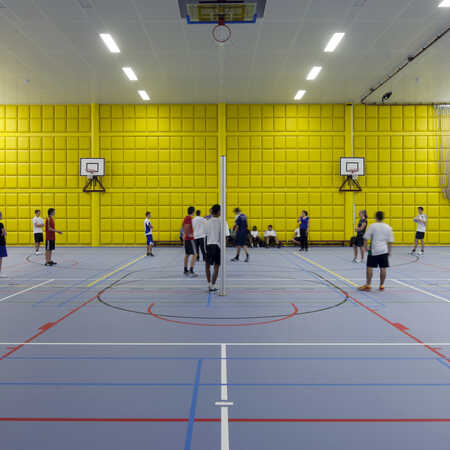
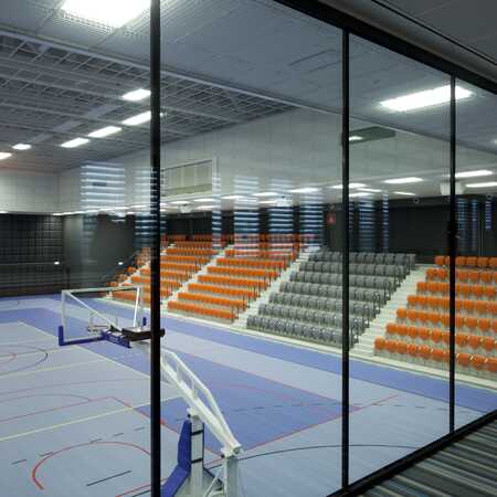
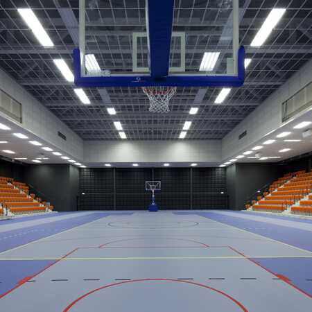
The top floors of the building house the classrooms and offices of the Albeda College educational program for Sport and Movement. Teachers and students at this college are the main users of the sports hall one level down. By operating two sliding walls, the hall can be divided into three equal spaces. One level below that, the local top-class basketball and volleyball clubs have their arena. The stands can seat 1.000 spectators. In the spaces around the arena and on the lower floors one can find a dojo, classrooms for dancing lessons, rooms for fitness, physiotherapy and massage. Offices for managers and administrators and a cafeteria complete the lay out. In order to house all these functions in the available volume, space had to be saved. This was achieved by giving the fire escapes in the four corners of the building a function in the constructive design. The offices and the large halls are supported by huge beams connecting those four corner towers. This gives the building such strength that no columns were necessary inside the big hall with the sports arena, allowing for a large open space offering every spectator optimal view of the game.
Style and looks
Clear, spacious and sturdy. Those are the words that characterize the visual impression this sport facility gives. The horizontal slats covering the facade are tilted in order to reflect rain and sunlight under the right angle, but are placed differently in front of classrooms and offices to allow daylight to enter. A large LED screen functions as a billboard to communicate news and dates for matches and other events. This adds to the strong presence of the building in the surrounding area.
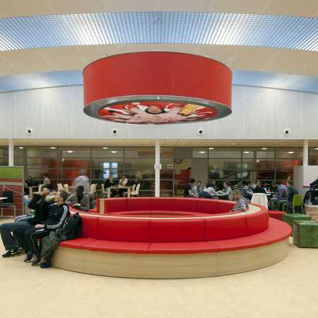
The interior has a powerful and clear colour palette, in yellow and orange, framed by straight black lines. The lighting is ambient and even, to increase overview and connectivity. Much attention was paid to the control of the acoustic quality in the building. Due to poor acoustics, both large crowds as well as an empty building can create an unpleasant stay in a sport facility. Controlled and evened-out sound increases the quality of a space significantly.
A smart and strong building, with a sturdy facade and a bright, clear and welcoming interior, where different streams of users can find their way without being in each other’s way.
Awards
Nominations: Rotterdam Architecture award 2011, Leisure & Sports Totaal Award 2009
Architect: ZJA
Client: The Municipality of Rotterdam
Jaar: 2010
Project: #362
Photos: Luuk Kramer
