Analysis of a square
For many residents and visitors to Antwerp the Groenplaats is one of the city’s living rooms. At the foot of the cathedral and showcasing the statue of Peter Paul Rubens, the square breathes the atmosphere of an attractive refuge in the middle of a shopping and entertainment district. Attention is drawn by the cafes and their terraces, by the large nineteenth-century buildings, the Hilton Hotel and the department store Grande Bazar.
The Groenplaats is also a busy and complex traffic junction. Car traffic finds its way to the underground parking garage, bus and tram lines have important stops at the square, and there are taxi stands and a distribution point of rental bicycles. Under the square is a station of what is known as the pre-metro line.
The existing situation is less than optimal, to say the least. The parking garage is run-down, the entrances and exits to the below-ground facilities are unfavourably placed in relation to the square. Kiosks and other small structures clutter and break up the public space. In summer the city suffers from heat stress, but below ground there is not enough space available to allow sizable trees to grow. More imaginative water management on and around the square, in the form of a fountain for example, might improve matters.
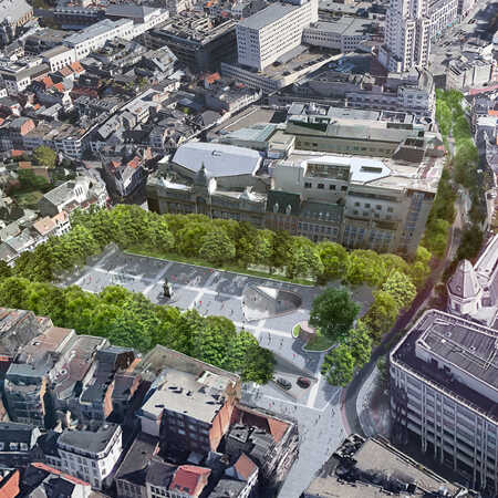
In order to transform the Groenplaats into a wide, green and stately square, the parking garage, the pre-metro station and all the connections with the world above ground and the Bazar need a radical redesign. Space could be created below the square to allow for the planting of a rectangle of big trees, and an underground plaza could connect the below-ground functions and provide a grand entrance to the square at ground level. In the plans of the city authorities, the Groenplaats is an important link in the Via Sinjoor, a long stretch of shops, historic buildings and restaurants, mainly intended for pedestrians and cyclists.
Underground reconfiguration
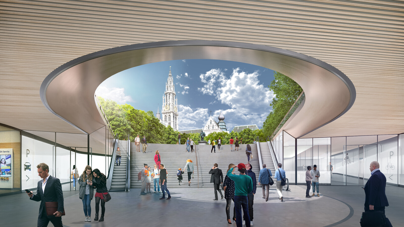
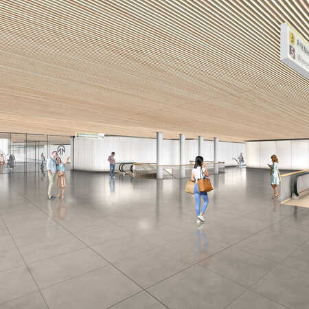
The architectural studio ZJA was one of those to responded to the city’s call for a design that would reconfigure and renovate the Groenplaats. ZJA took as its starting point the unification and clarification of the underground world. At the centre of its design stands a wide, leisurely stairway that gives access to a central underground plaza connecting the various functions. Those climbing the stairs to reach the Groenplaats have a clear view of the statue of Rubens. Downstairs, brushed steel, wooden strips on the ceiling, soft indirect lighting and many translucent glass elements create a safe, clear and pleasant environment. The entrances to the parking garage, bicycle parking, pre-metro station and Bazar are immediately in view and given a transparent look.
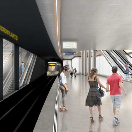
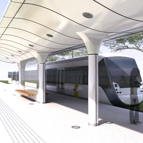
The freshly renovated pre-metro station is provided with a wider, more open layout, while the escalators leading to the platforms are moved and given wider entrances, lined with glass panels. Flowing walkways, rounded corners and ridges soften the look of the station. A sophisticated lighting plan reinforces the experience of a pleasant and safe environment where everyone can see and be seen.
The ZJA design extends the parking garage to the west, partly to replace a damaged wall, but also to increase capacity and create more room below ground for the roots of the rectangle of big trees to be planted on the square. The garage entrance is widened, and a new layout optimizes the use of the available space for circulating traffic.
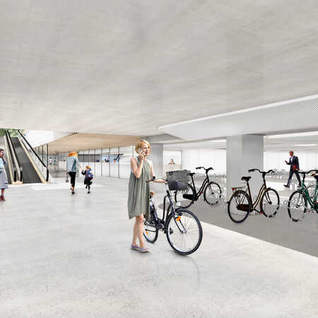
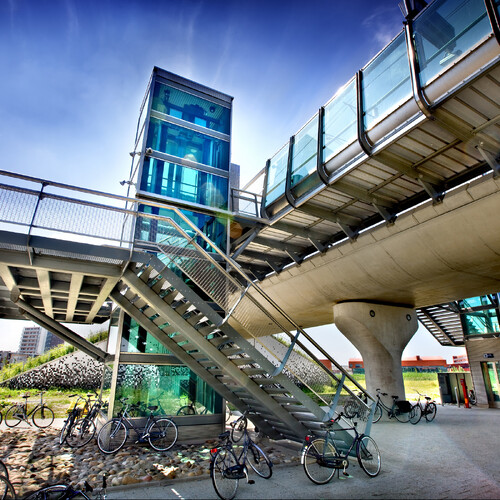
On the first underground level is the bicycle parking facility, close to the transparent entrance, with daylight dominating its look and feel. Its parking spaces have room for transport bikes, and there are charging points for electric bicycles and a repair service.
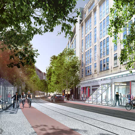
At Schoenmarkt, around the corner from the Groenplaats, the pre-metro station has an additional entrance. Because of limited space, the staircase and the escalator on the south side are in line. The north entrance has its escalator inside a glass structure on the street and the staircase within the building. In the design of the platforms and corridors, flowing lines, a maximum of free height and a clear view of the space are given priority.
Materials and atmosphere
In the design of the underground world, ZJA focusses on the use of materials to determine the atmosphere. Well-chosen materials add to the experience of the high and light spaces, eliminating dark corners and recesses. The use of wooden benches, stone, wooden strips on the ceiling and transparent or translucent glass walls all help to produce a friendly experience.
The nature of the ZJA design shows itself best in the connecting square, which opens onto Groenplaats in a spacious, inviting oval. The new layout of Groenplaats is wide and open, with long, flowing lines for pedestrians under the trees alongside the Rubens statue. This is the welcoming experience encountered by those coming up onto Groenplaats from the underground central plaza, the sky filled with the majestic grey of the cathedral.
Architect: ZJA
In collaboration with: Sweco Belgium
Year: The design was created in response to a government procurement process in 2020 but not ultimately implemented.
Project: #1218
