Gateway buildings on a new square
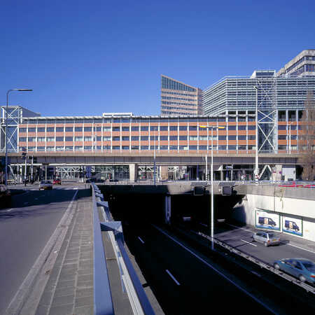
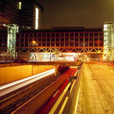
The Utrechtsebaan (the extension to the A12 motorway) cuts across The Hague between the area around the Central Station and the Beatrix Quarter. In the masterplan developed in the time when the new city centre was designed, the ideas of town planner Joan Busquets were key. The motorway formed a coarse scar across the city, which would be healed by the creation of a city square. The square in question was the Grotiusplaats, where the motorway is sunk below ground level, and an area of homes, shops and offices was created with generous space for pedestrians, covered galleries and two pedestrian bridges over the Utrechtsebaan.
On either side of the Grotiusplaats, two gateway buildings were planned, standing over the motorway. They were intended to screen off the square and to connect the two parts of the city. Architectural studio ZJA was commissioned to design them.
Office blocks as bridge and gate
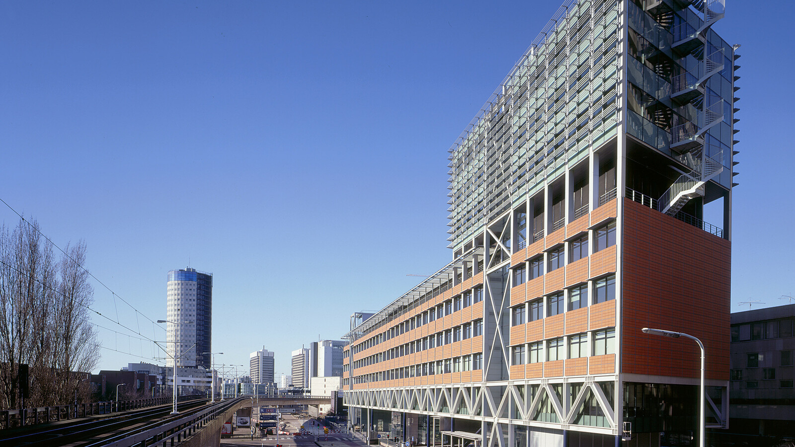
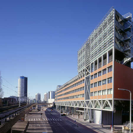
A gate is an entrance to a closed space, while a bridge is a connection between areas divided by a barrier. The two office blocks on the Grotiusplaats combine these two features. To the passing motorist they are gates, openings in the urban volume that stretch light and bright across the sunken motorway. To pedestrians they are an inviting, open environment giving access to the square.
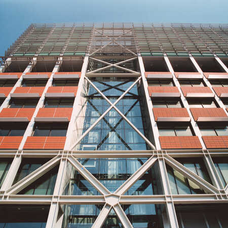
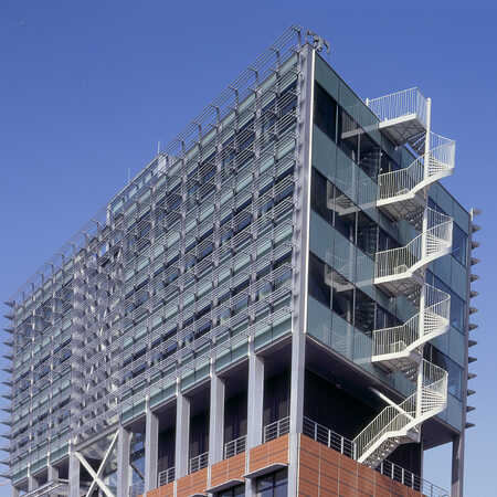
Underneath the five storeys of office space, therefore, is an open area with slim columns, glass frontages, shops and access to the offices. This gives height and brightness. The robust, crafted structure with steel lattice trusses then catches the eye, evoking associations with a bridge. On both sides of the road a steel core is discernible. The application of high-strength concrete in the top floors of the load-bearing structure enables the buildings to retain a light, slim appearance. The building on the eastern side has a tower on top of its five floors on the north side, providing extra storeys.
Two different facades
The buildings on the Grotiusplaats have strikingly different facades. Both have a glass curtain wall on the side facing the square and a facade of hollow brick-red tiles on the other side. The addition of stone and colour, and the way the upper floors are set back from the frontages behind the steel lattice trusses, make the design fit with the urban environment. To avoid the impression of a minuscule ant among tall glass towers, the urban design concept also provides for Z-shaped, stepped building volumes. The buildings are spacious, and with regard to material, shape and colour they form a lively addition to the city.
The buildings have a light, open character, but the eye-catching trusses also add to the environment, with diagonals that are reflected in the steel cores. Unusually, the steel load-bearing structure has been left without cladding. Research was carried out into the building’s fire safety, and the large, free, open steel surfaces were shown to ensure a rapid release of heat into the atmosphere in case of fire, which meant that fire-resistant cladding was unnecessary.
Award:
Nomination: EU Mies van der Rohe Award 2001
Client: Multi Vastgoed AM
Engineering: Grabowsky & Poort
Year: 1997
Project: 061
